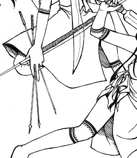
It's not just applying ink over the pencil lines or rough sketch. You are following the very lines you drew but the solidity of the ink gives the drawing another quality altogether.
It can either be considered a good job-- or just a thick slop of scribbles when done wrong.
I've read around that there are some rules to manga inking... seeing as I didn't have the required materials listed to practice on I made do with the typical sign pens you can buy out of bookstores, and they're cheaper.
There are some gel ink kinds and some waterproof kinds-- whichever I was comfortable in using works for me. I wasn't after the brands, but Pilot brands proved best. They don't stain, they don't fade when rubbed with an eraser and with age.
To know what I mean
 of single inking, look at the drawing on the right and observe the lines.
This was the very first inking technique I learned from the friend who taught me the graphing method. She also finished her drawings this way before coloring them.
In single inking, unless you have a steady hand, its hard (almost impossible) to hide the quivering lines. This is a common error though, but they're easily hidden once colors are applied on the drawing.
The human eye will focus more on what's catching than on common black, except if the observer is a critic or a rival then you're in for a real debate. Worst case scenario, you'll start arguing over the simplest thing such as how the curved line looked more crooked.
As I've mentioned there are rules to inking. I threw those out into the wind and compared with other artists their way of inking. They had their own style too, which my sister was eager to learn. Architect students have admirably neat lines-- even if their hands were shaking a lot while gripping the pen.
 Since we can't entirely imitate others way of inking, we developed our own style too based on the inking techniques we've observed. It was much easier that way.
For practice I tried, or mostly my sister did while she had me drawing for her to practice on, on several scrapped drawings I had lying around.
The most common practice was to -- plain and simple -- thicken the lines. It works for most drawings, but not all.
All it did was to add a solid effect on the drawing.
Another one we tried was to use the blackness of the ink to fill in where there were supposed to be shaded areas. It gave the drawing another effect, such as adding a little life to the scene.
Just try to thicken areas where there are are sharper edges, areas where lines connect to form a pointed triangle, and use the black fillings as shadows.
Of course, there are also various ways to use inking shadows as done in the second drawing above. There are also crosshatching, mesh, etc.
Inking can also give the desired effect of changing the whole aspect of the drawing's appearance. Depending on how you control your pressure, you can apply weight to the thickness of the lines. For example below:
Line weight can make a BIG difference in the appearance of the drawing. As done with the hairs above, the lines are thicker from inside and slowly thin out to the points. It gives of the effect of the character having silky hair to look at.


0 comments:
Post a Comment